Skip to content
Watercolor Journal
… a place for people with a passion for art
Menu
Home
Membership Subscriptions
My Etsy Store
Watercolors of Nature blog
Welcome
Butterfly pe and betel leaf tangle
April 26, 2024
Tropical sunset
April 2, 2024
April 2, 2024
Hibiscus Sabdariffa watercolor art
March 21, 2024
March 21, 2024
Insect painting short demo
March 12, 2024
Tiger moth watercolor on paper
March 12, 2024
Plumeria pudica, Nag champa
March 8, 2024
March 8, 2024
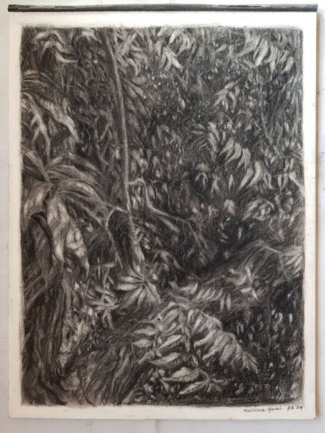
Neem and mango trees in charcoal WIP
February 27, 2024
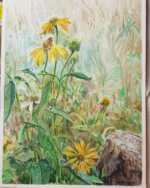
Asters and meadows
February 22, 2024
Countryside – roses and robins
February 13, 2024
Mystical tree charcoal drawing
February 5, 2024
February 5, 2024
Sea shells pen and wash drawing stages and final
January 27, 2024
January 27, 2024
Chinese painting – roses and bee
January 22, 2024
Bougainvillea and bird watercolor painting
January 15, 2024
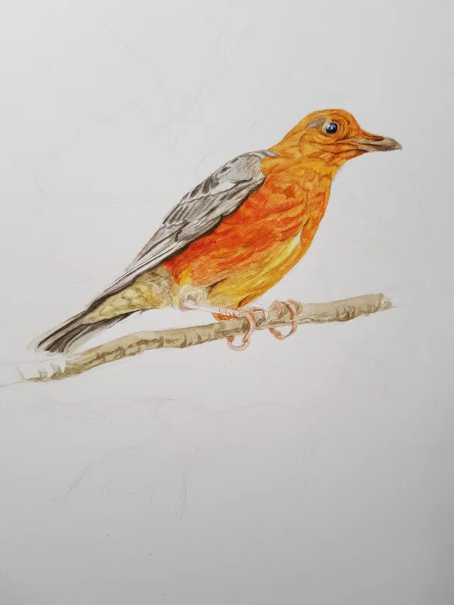
Orange headed thrush watercolor demo
January 9, 2024
Art reflections and new year goals
January 4, 2024
January 4, 2024
Rooster – pen and wash drawing stages
January 4, 2024
January 4, 2024
Rose ringed parakeet
December 29, 2023
Nature journaling page
December 27, 2023
Insect sketches
December 26, 2023
December 26, 2023
Common mynah
December 23, 2023
December 23, 2023
Posts navigation
Older posts
Subscribe
Subscribed
Watercolor Journal
Join 238 other subscribers
Sign me up
Already have a WordPress.com account?
Log in now.
Watercolor Journal
Customize
Subscribe
Subscribed
Sign up
Log in
Report this content
View site in Reader
Manage subscriptions
Collapse this bar
Loading Comments...
Write a Comment...
Email
Name
Website